



September 8, 2025

How Color Can Transform Your Home and Mood
Make Your Home Feel Brand New
Small updates to your home can make a big difference. Adding trendy splashes of color can completely change the “same old, same old” vibe of your home.
We all know how tricky it can be to choose a paint color, so we did the research for you. Here are the on-trend color choices and how they can impact your mood. By updating your walls, you’ll not only love the new look of your home, but you can also give yourself an energy boost!

Sophisticated Blush
If you’re still loving the rose gold aesthetic, “Sophisticated Blush” is the perfect modern complement. This muted, almost-neutral pink adds a refined warmth to any space without feeling overly feminine or bold.
Soft and calming, this tone brings a sense of serenity to a room while maintaining a polished look. Paired with warm browns or soft beiges, it creates an effortlessly elegant palette—especially suited for bedrooms or dining areas where you want a touch of understated glamour.

Peach Fuzz
Keeping the warmth going, “Peach Fuzz” currently wears the “most popular” crown, earning the title of Pantone’s 2024 Color of the Year. This soft, sun-kissed shade brings gentle energy and depth to your space.
Symbolizing care and connection, Peach Fuzz captures the desire to nurture ourselves and those around us. Whether used on a statement wall, in accent decor, or woven into patterned textiles, it adds a welcoming glow that feels both comforting and contemporary.
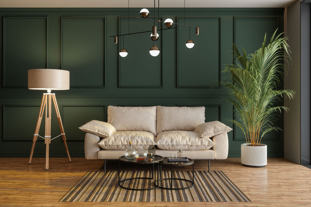
Moody, Forest Green
If you’re ready to bring a touch of the outdoors in, “Forest Green” delivers depth and drama with a modern edge. This rich, saturated hue commands attention without feeling overbearing, creating a space that’s bold yet timeless.
Paired with warm woods, brass accents, or soft neutrals, Forest Green adds striking contrast and sophistication. It’s a statement color that works beautifully in dining rooms, offices, or living spaces where you want a sense of refinement and strength.

Serene Blue
As homes become more focused on wellbeing, designers are recommending the creation of “tech-free sanctuaries” where you can completely unplug and mentally recharge. This shade of serene blue is perfect for your zen den, in-home yoga studio, or master bathroom.
Shades of blue are known to lower blood pressure and slow respiration, encouraging a sense of calm and clarity. Just remember—deeper blues can feel moody, so it’s best to balance them with soft neutrals to keep the vibe relaxed and uplifting.

Mocha Brown
Rounding out the palette with a dose of warmth, “Mocha Mousse”—Pantone’s 2025 Color of the Year—embraces the growing “warm-luxury” trend. This rich, indulgent brown evokes the subtle decadence of cacao, coffee, and fine leather, bringing elegant depth to your space.
Understated yet full of character, Mocha Mousse creates an inviting ambiance without feeling heavy or overly rustic. Pair it with cream-toned neutrals, warm metallics like brass, or walnut finishes—especially in living rooms, offices, or cozy corners where you want mood and sophistication to quietly prevail.
Most importantly, remember that the color of your walls isn’t permanent. You can always switch it up, so why not experiment and try something new? Happy Painting!
(Visited 428 times, 2 visits today)